

Selecting the right kids room colors is far more than an aesthetic design choice; it is an environmental intervention that directly influences a child’s circadian rhythm, emotional self-regulation, and neurological development. Because young children process sensory information with heightened sensitivity, the optical wavelengths reflected by bedroom walls can either stimulate stress hormones or trigger calming physiological responses. By replacing saturated primary hues with scientifically validated pastel and earth-toned palettes, parents can transform chaotic bedrooms into restorative sanctuaries. This comprehensive guide explores the neurological mechanisms of color psychology, evaluates optimal paint shades by developmental age brackets, details neuro-inclusive design strategies, and outlines indoor air safety protocols for healthy home redecoration.
Kids room colors are interior architectural design elements that utilize specific light wavelengths to influence child psychology, sleep architecture, and daily behavioral regulation. Best practices prioritize low-chroma, muted tones—such as soft sage green, dusty blue, and warm terracotta—which minimize visual overstimulation and support natural circadian melatonin production.
| Color Family | Dominant Wavelength | Physiological & Psychological Impact | Ideal Bedroom Application |
| Sage & Muted Greens | 520 – 560 nm | Lowers heart rate, reduces cortisol, and mimics calming biophilic outdoor environments. | Primary wall color across all age brackets; excellent for sleep and focus zones. |
| Dusty & Soft Blues | 450 – 495 nm | Decreases blood pressure and core body temperature; signals evening rest to the brain. | Dedicated sleeping zones and reading nooks; highly recommended for toddlers. |
| Warm Terracotta & Sand | 590 – 620 nm | Provides emotional grounding and spatial security without triggering high energy arousal. | Accent walls or play areas requiring warm, comforting visual containment. |
| Muted Lavender & Lilac | 380 – 450 nm | Induces deep physical relaxation and aids in de-escalating bedtime tantrums. | Nurseries and toddler spaces designed for high-sensory or sensitive children. |
How does color psychology dictate sleep quality in a child’s bedroom?
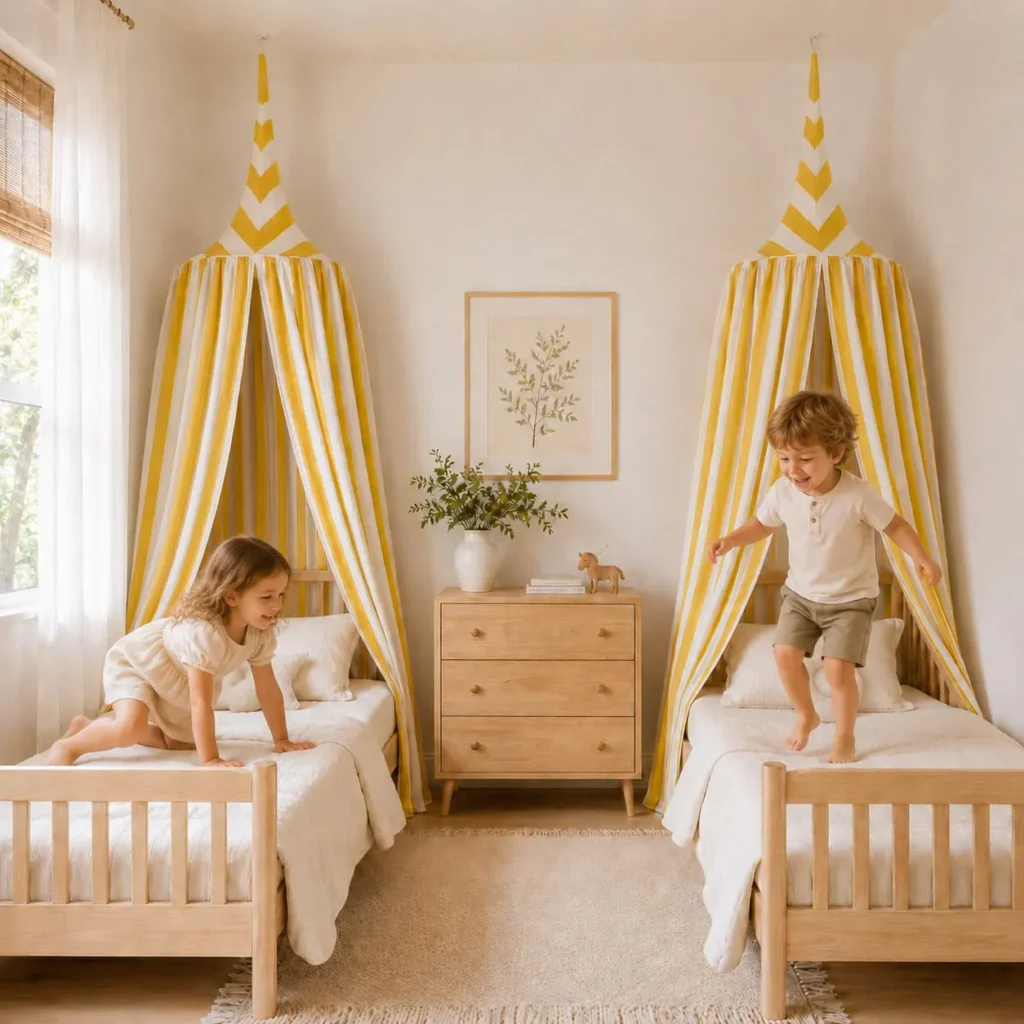
To understand how room color impacts sleep quality, we must examine the physiological interaction between human ocular anatomy and interior light wavelengths. When light reflects off painted wall surfaces, it enters the eye through the retina, striking specialized photoreceptor cells known as intrinsically photosensitive retinal ganglion cells (ipRGCs). These cells do not contribute to visual image formation; instead, they send direct neural signals to the suprachiasmatic nucleus (SCN)—the brain’s master circadian clock located within the hypothalamus.
Depending on the energy frequency of the reflected light, the hypothalamus instructs the pineal gland to alter hormone production. High-energy wavelengths, particularly those found in bright, saturated colors, signal daytime vigilance to the brain, suppressing the secretion of melatonin while elevating cortisol and adrenaline levels. Conversely, low-chroma, muted color palettes reflect softened, low-energy wavelengths that allow the autonomic nervous system to shift from sympathetic (fight-or-flight) arousal to parasympathetic (rest-and-digest) dominance, preparing the child’s body for deep, restorative sleep.
The biology of light wavelengths and circadian rhythm regulation
Different paint colors absorb and reflect specific wavelengths of the visible light spectrum, which ranges approximately from 380 to 750 nanometers (nm). Saturated primary colors like bright yellow (570 nm) and neon orange (590 nm) carry high luminance values that continuously stimulate retinal receptors, tricking the developing brain into perceiving perpetual daylight. In a bedroom setting, this continuous optical stimulation delays the natural evening rise of melatonin, making it neurologically difficult for a toddler to initiate sleep at their designated bedtime.
In contrast, shades within the muted green and soft blue spectrum reflect wavelengths that align with the natural visual cooling of evening twilight. When interior walls display low-reflectance pastel finishes, the reduced optical intensity allows the pineal gland to initiate melatonin synthesis without interruption. This hormonal regulation stabilizes sleep architecture, lengthening the duration of REM (Rapid Eye Movement) and deep slow-wave sleep cycles, which are critical for memory consolidation and emotional processing in growing toddlers.
Why high-contrast primary colors disrupt emotional regulation before bedtime
Many traditional nurseries and playrooms feature bold, high-contrast primary color schemes—such as fire engine red, royal blue, and canary yellow—under the mistaken assumption that vibrant rooms stimulate intelligence. While high-contrast visual environments are appropriate for short-duration play areas, surrounding a child with intense chromas during evening winding-down periods creates severe sensory fatigue. Red wavelengths (620–750 nm), in particular, possess the longest optical wavelengths and have been clinically proven to increase respiration rates, elevate blood pressure, and induce feelings of urgency or agitation.
When a toddler exhausted from a day of physical learning enters a bedroom dominated by high-contrast colors, their central nervous system struggles to process the intense visual load. This visual noise often manifests behaviorally as hyper-activity, resistance to bedtime routines, and emotional meltdowns. Replacing these aggressive hues with balanced, low-saturation tones removes the environmental stressor, allowing the child to self-regulate emotionally and transition smoothly into bedtime reading and rest.
Analyzing behavioral sleep metrics across different room color schemes
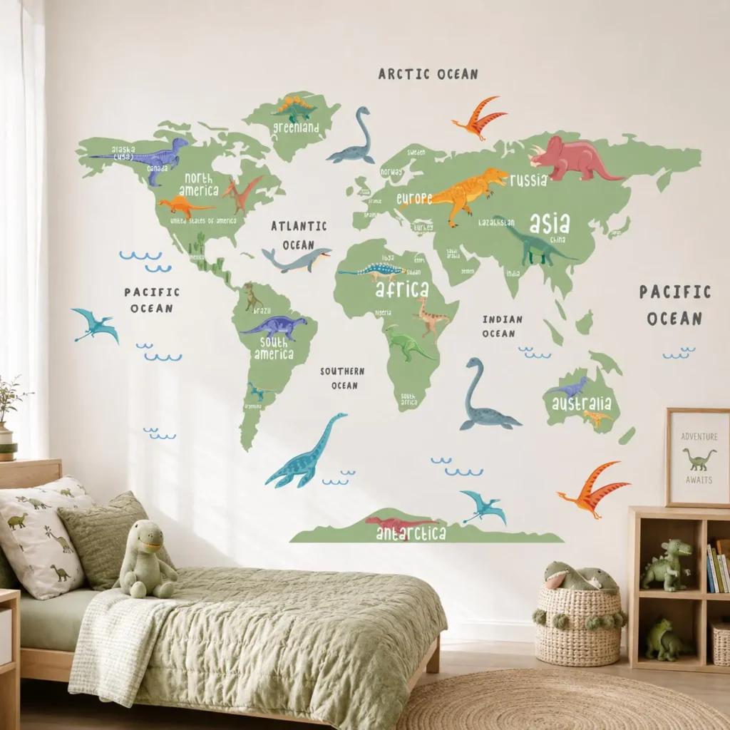
Evaluating the real-world impact of interior color palettes requires comparing child sleep behaviors across distinct environmental designs. Clinical observations in pediatric occupational therapy confirm that modifying a bedroom’s dominant color scheme can significantly alter bedtime resistance rates and nighttime awakenings. The following table contrasts behavioral sleep metrics observed in high-stimulation primary color rooms versus calming, muted pastel environments.
| Behavioral Sleep Metric | High-Stimulation Primary Palette (Red/Yellow/Bright Blue) | Calming Muted Palette (Sage/Dusty Blue/Warm Sand) |
| Average Sleep Onset Latency | 45 to 60 minutes (Prolonged tossing and vocalization) | 15 to 20 minutes (Rapid transition to slumber) |
| Nighttime Awakening Frequency | High (2 to 4 episodes requiring parental intervention) | Low (0 to 1 episode with high self-soothing success) |
| Bedtime Meltdown Incidence | Frequent (Associated with sensory overstimulation) | Rare (Associated with environmental tranquility) |
| Morning Mood & Alertness | Groggy or irritable due to fragmented slow-wave sleep | Calm and refreshed following restorative sleep architecture |
| Autonomic Nervous State | Elevated sympathetic arousal (High heart rate) | Parasympathetic dominance (Lowered resting heart rate) |
What are the best kids room wall color ideas by developmental age?
A child’s visual processing capabilities and psychological needs evolve dramatically from infancy through the early school years. A color palette that supports a six-month-old infant’s developing eyesight may prove uninspiring for a curious toddler or too juvenile for an independent preschooler. Therefore, interior design specifications should align directly with developmental milestones, adapting the room’s color frequency to meet the child’s changing sensory and cognitive requirements.
By segmenting color selection into distinct age brackets, parents can create tailored micro-environments that support specific developmental tasks. Whether designing a tranquil nursery that aids in infant visual tracking or a sophisticated preschool room that encourages independent focus, matching paint ideas to neurological maturity ensures that the bedroom functions as a dynamic, supportive developmental tool throughout early childhood.
Infancy (0 to 12 months): High-contrast foundations to muted pastels
At birth, an infant’s visual system is structurally immature; newborns can only perceive high-contrast black, white, and grey patterns at a limited focal distance of 20 to 30 centimeters. While black-and-white visual cards are essential for early retinal stimulation during supervised floor play, painting an entire nursery in stark black and white creates an overly harsh, clinical atmosphere. Instead, the primary wall surfaces should feature soft, warm neutrals—such as ivory, warm cream, or gentle oatmeal—which provide a soothing, light-diffusing backdrop for sleeping.
As the infant reaches 3 to 6 months of age, color vision develops rapidly, starting with the perception of red and green wavelengths, followed by blues and yellows. To support this visual emergence without causing sensory overload, introduce muted pastel accents into the neutral room. Soft sage greens and pale terracotta tones applied to lower wainscoting or structural alcoves offer gentle visual interest that encourages spatial tracking while maintaining the serene, low-arousal atmosphere necessary for frequent daytime naps and night sleep training.
Early toddlerhood (1 to 3 years): Earth tones for sensory grounding
Between the ages of one and three, children experience an explosion of gross motor mobility, autonomous exploration, and emotional intensity. Toddlers are continuously processing vast amounts of environmental data, which frequently pushes their nervous systems to the brink of sensory overload. During this dynamic stage, the bedroom must function as a grounding sensory anchor—a physical space that naturally dampens environmental noise and promotes emotional centering after an active day of learning.
Earth-inspired color palettes—incorporating shades like olive green, clay, warm taupe, and muted mustard—are exceptionally effective for toddler regulation. These biophilic colors mimic the organic visual spectrum of the natural outdoor world, which evolutionary biology primes the human brain to perceive as safe and stable. Applying a soft, matte earth tone to the primary walls surrounding the toddler’s floor bed creates a secure visual cocoon that reduces spatial anxiety, encouraging the child to rest independently without feeling overwhelmed by their surroundings.
Preschool and beyond (4 to 6+ years): Soft blues and dusty roses for focus
As children enter the preschool and kindergarten years (ages four to six and beyond), their bedroom transitions from a simple sleeping and dressing space into a multi-functional studio for independent reading, imaginative play, and early academic tasks. The color scheme must now balance the relaxation required for sleep with the cognitive clarity needed for focused tabletop activities. At this stage, children also begin expressing strong personal color preferences, which can be thoughtfully integrated using sophisticated, muted shade variations.
Dusty blues, slate greys, and muted lavender or dusty rose tones represent optimal color selections for preschool bedrooms. Scientific research in environmental psychology demonstrates that blue wavelengths lower heart rates and improve concentration, making soft blue an ideal wall color for reading nooks and study zones. If a child requests pink or purple, avoid bubblegum or neon magenta; instead, specify a desaturated dusty rose or mauve finish. These sophisticated hues honor the child’s autonomy while preserving a refined, calming aesthetic that integrates seamlessly with the rest of the home’s architectural style.
How do you design an accent wall without creating visual noise?
In contemporary residential architecture, the accent wall serves as a powerful design technique to introduce color, depth, and spatial hierarchy into a room without overwhelming the entire square footage. However, in a child’s bedroom, an improperly executed accent wall can easily backfire. Saturated paint colors, chaotic geometric murals, or busy wallpaper patterns can create an intense visual magnet that distracts the developing brain, disrupting sleep routines and generating visual clutter.
To successfully implement an accent wall in a kids room, designers must prioritize visual balance and spatial harmony. The accent feature should anchor the room’s layout—typically positioned directly behind the bed headboard or defining a quiet reading corner—while the remaining three walls recede in a soft, light-diffusing neutral tone. This strategic zoning draws the eye toward a point of security and containment without subjecting the child to continuous, 360-degree optical stimulation.
Balancing solid paint colors with minimalist, textless wall decor
When designing an accent wall, the interplay between the painted background and vertical wall decor dictates the room’s overall sensory frequency. If an accent wall is painted in a muted terracotta or sage green, covering that surface with typography posters, alphabet banners, or loud cartoon canvases creates jarring cognitive dissonance. Written text and complex graphic slogans force the child’s brain into active analytical processing, actively preventing the cognitive relaxation required for afternoon quiet time or evening sleep.
To preserve the calming benefits of the accent shade, pair solid paint surfaces exclusively with minimalist, textless, and realistic wall decor. For example, applying clean, text-free wall decals from Dos Junior—featuring true-to-scale botanical leaves, accurate solar system planets, or realistic woodland wildlife—directly onto a muted accent wall introduces profound aesthetic beauty without generating visual noise. Because these sophisticated designs eliminate typographical clutter and cartoon exaggerations, they integrate seamlessly into the architectural layout, allowing toddlers to engage in peaceful visual observation and natural storytelling.
Applying the 60-30-10 interior design rule to children’s spaces
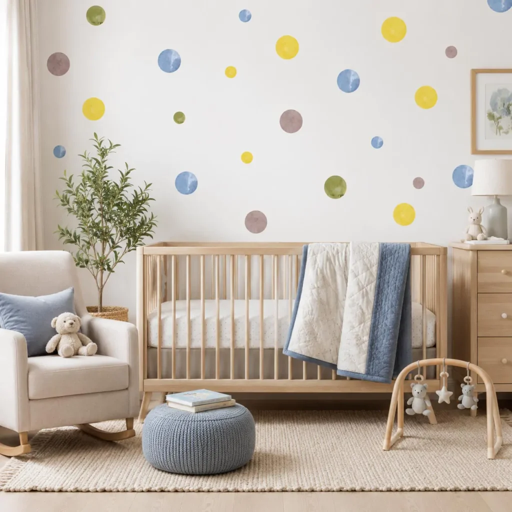
The 60-30-10 rule is a time-tested interior design framework that ensures color balance and prevents visual monotony or chaos in architectural spaces. When adapted for a child’s bedroom, this mathematical ratio provides a foolproof formula for distributing color frequencies across wall planes, furniture finishes, and textile accessories. Adhering to this structured proportion guarantees that the room maintains a cohesive, harmonious aesthetic that feels curated rather than cluttered.
- 60% Dominant Neutral Background: Allocate the majority of the room’s visual surfaces—including three primary walls, ceiling planes, and large furniture carcasses—to a soft, light-reflecting neutral tone like warm ivory, pale taupe, or soft grey.
- 30% Secondary Calming Color: Assign the secondary color to the primary accent wall, area rugs, window drapery, or bed linens, utilizing a scientifically calming shade such as sage green, dusty blue, or muted terracotta.
- 10% Tactile & Visual Accent: Reserve the final ten percent for small, intentional decor elements—such as natural timber shelving, ceramic table lamps, or textless realistic wall art—to introduce organic texture and focal depth without dominating the visual field.
Utilizing matte and eggshell finishes to prevent glare and sensory irritation
The physical sheen of interior wall paint significantly impacts how light behaves within a bedroom, directly affecting sensory comfort. High-gloss, semi-gloss, and satin paint finishes contain high concentrations of reflective resins that bounce natural daylight and artificial light fixtures across the room. This specular reflection creates harsh glare spots, sharp shadows, and visual flickering, which can be deeply irritating to a developing child’s visual processing system, particularly for neuro-divergent children with heightened sensory sensitivities.
To eliminate optical glare and create a soft, velvety visual texture, strictly specify premium matte or low-sheen eggshell paint formulations for all bedroom wall surfaces. Advanced modern matte paints are engineered with ceramic microspheres that absorb and diffuse light evenly across the wall plane, completely eliminating specular reflections while maintaining high washability. This diffused light reflection softens room angles, reduces eye strain, and fosters a gentle, enveloping atmosphere that supports sensory relaxation from morning until night.
What calming colors support kids with autism and sensory needs?
Children diagnosed with Autism Spectrum Disorder (ASD), Attention Deficit Hyperactivity Disorder (ADHD), or Sensory Processing Disorder (SPD) often possess nervous systems that process visual and auditory stimuli with extreme intensity. For these neuro-divergent children, a bedroom is not merely a place to sleep; it is a critical sensory decompression zone where they must retreat to recover from the sensory demands of the external world. When environmental color frequencies are mismanaged, sensory-sensitive children can experience rapid cognitive overload, leading to behavioral meltdowns, severe anxiety, and chronic sleep insomnia.
Designing a neuro-inclusive bedroom requires applying specialized principles of sensory ergonomics. Every surface color, lighting temperature, and spatial transition must be calculated to minimize autonomic nervous system arousal. By eliminating high-frequency visual triggers and establishing predictable, low-stimulation color zones, parents can build a therapeutic home environment that honors their child’s neurological uniqueness and actively facilitates emotional self-regulation.
Neuro-inclusive design principles for sensory processing sensitivities
Neuro-inclusive color selection begins with the complete elimination of colors that fall at the extreme ends of the visible spectrum—specifically high-frequency violets and low-frequency reds or intense yellows. Research in sensory occupational therapy indicates that neuro-divergent children frequently perceive high-chroma colors as vibrating or visually aggressive, which can trigger vestibular disorientation and physical distress. Furthermore, busy wallpaper patterns featuring repetitive small geometries or sharp contrast lines can cause visual distortion and dizziness.
To create a visually stable sensory environment, prioritize ultra-desaturated, monochromatic color palettes featuring pale grey-greens, soft taupes, and warm sands. These low-arousal shades provide a predictable, non-threatening visual boundary that allows the sensory-sensitive brain to relax its environmental vigilance. When transitioning between different functional zones of the room—such as moving from the dressing area to the sleep zone—utilize gradual, tonally similar color shifts rather than sharp, contrasting color blocking to maintain continuous sensory equilibrium.
The therapeutic power of muted greens, blues, and warm sands
Within the spectrum of neuro-inclusive design, three specific color families stand out for their documented therapeutic efficacy: muted greens, desaturated blues, and warm sand neutrals. Muted green wavelengths (520–540 nm) require the least amount of ocular adjustment by the human eye, placing zero mechanical stress on eye muscles and allowing neural visual processing pathways to rest completely. This effortless visual assimilation makes sage and olive tones exceptionally grounding for children experiencing sensory meltdown recovery.
Desaturated blue tones act as a natural physiological brake on the autonomic nervous system, clinically lowering respiration rates and reducing hyper-active physical impulsivity. For children who seek deep pressure or visual containment to feel secure, pairing muted blue walls with warm sand or clay floor textiles creates an optimal sensory balance. The warm sand tones provide a psychological sense of earthly stability and physical warmth, counteracting any potential sterility from the blue walls and establishing a deeply restorative sensory sanctuary.
Avoiding visual triggers: Wall murals, high contrast, and flickering lights
Even when walls are painted in scientifically calming colors, introducing improper lighting fixtures or chaotic decorative murals can completely destroy the sensory integrity of a neuro-inclusive bedroom. Large, highly complex wall murals featuring crowded cityscapes, cartoon crowds, or abstract geometric puzzles demand constant visual decoding. For a child with autism or sensory processing difficulties, this visual complexity prevents the brain from entering a resting state, turning the bedroom into a source of continuous cognitive fatigue.
Artificial lighting must be managed with equal precision to prevent sensory irritation. Immediately remove standard fluorescent bulbs or cheap LED fixtures from the children’s bedroom, as these light sources emit a high-frequency micro-flicker that, while imperceptible to most adults, is consciously registered by sensory-sensitive children as a painful visual strobe. Instead, install high-quality, dimmable LED luminaires with a warm color temperature of 2400K to 2700K and a high Color Rendering Index (CRI > 90). Paired with blackout window treatments, this controlled lighting environment eliminates external visual triggers and ensures absolute sensory protection during sleep.
How do you ensure indoor air safety when painting a kids room?
While selecting the correct optical paint shade is essential for psychological comfort, evaluating the chemical formulation of the paint is critical for physical health. Conventional interior architectural paints, primers, and synthetic wall finishes are chemical compounds that historically relied on toxic solvents and heavy metals to achieve smooth application and rapid drying. When applied to enclosed bedroom walls, these traditional coatings initiate a prolonged chemical evaporation process that severely compromises indoor air quality.
Because infants and toddlers breathe at a significantly faster respiration rate per body weight than adults—and spend up to 12 to 14 hours per day sleeping inside their bedrooms—they are highly vulnerable to airborne chemical toxins. Inhaling hazardous paint vapors during early physical development can impair lung function, disrupt endocrine systems, and trigger chronic allergic reactions. Establishing a rigorous indoor air safety protocol during room redecoration ensures that the aesthetic transformation of the bedroom does not come at the expense of the child’s physical well-being.
The hidden dangers of volatile organic compounds (VOCs) in paints
Volatile Organic Compounds (VOCs) are carbon-based chemical solvents—including benzene, toluene, formaldehyde, and xylene—that readily vaporize at room temperature, releasing toxic gas molecules into indoor air. In conventional paint formulations, VOCs are used to keep paint binders liquid in the can and help the coating flow smoothly across wall surfaces. However, once the paint is applied, these hazardous chemicals off-gas continuously into the bedroom atmosphere for months, or even years, after the paint feels dry to the touch.
Acute exposure to elevated indoor VOC levels during paint drying causes immediate physical distress in young children, manifesting as eye irritation, persistent coughing, headaches, dizziness, and nausea. Prolonged, chronic exposure to low-level VOC off-gassing has been clinically linked to the development of childhood asthma, eczema flare-ups, neurological impairment, and cognitive attention deficits. To protect developing infant respiratory and nervous systems, parents must treat the elimination of VOCs as a mandatory architectural requirement rather than an optional eco-friendly preference.
Identifying zero-VOC formulations and GREENGUARD Gold certification
Navigating the commercial paint market requires careful scrutiny of product labels and third-party environmental safety certifications. Marketing claims such as “Low-VOC” or “Eco-Friendly” are largely unregulated and can still permit chemical concentrations up to 50 grams per liter of toxic solvents. To ensure absolute atmospheric purity, specifiers must strictly purchase “Zero-VOC” water-based acrylic or mineral silicate paint formulations, which contain less than 5 grams per liter of volatile compounds—the technical threshold for trace background levels.
The gold standard for evaluating indoor air safety in children’s products is the GREENGUARD Gold Certification, administered by UL Solutions. Products achieving GREENGUARD Gold status undergo rigorous dynamic environmental chamber testing, screening for the release of over 360 distinct hazardous chemicals and establishing stringent VOC emission limits explicitly calculated to protect vulnerable populations, including infants and the elderly. When selecting wall paints, primers, adhesives, and textless decorative decals, verifying GREENGUARD Gold or equivalent EN 71-3 European toy safety certification guarantees that the materials will not introduce toxic fumes into the child’s sleeping sanctuary.
Proper room ventilation and drying timelines before child occupancy
Even when utilizing certified Zero-VOC and GREENGUARD Gold paints, establishing a structured ventilation and curing timeline is mandatory before allowing a child to re-occupy the bedroom. Water-based acrylic paints release water vapor and harmless trace additives as they coalesce into a solid structural film; providing adequate atmospheric exchange accelerates this physical curing process and flushes residual odors from the enclosed space.
- Isolate the Work Zone: Seal the bedroom doorway with heavy-duty plastic sheeting and painter’s tape during application to prevent paint vapors from migrating into adjacent living areas.
- Maximize Cross-Ventilation: Open all bedroom windows fully and position high-velocity box fans blowing directly outward through the window opening to create negative pressure, exhausting room air to the exterior.
- Enforce a 72-Hour Vacancy: Prohibit child occupancy, sleeping, or playing inside the newly painted room for a minimum of 72 continuous hours following the final coat application.
- Deploy Air Purification: Run a medical-grade HEPA air purifier equipped with a heavy-duty activated carbon adsorption filter continuously at maximum fan speed for five days post-painting to capture any lingering gaseous compounds.
Frequently asked questions
What color is best for toddler sleep?
Muted, low-saturation colors—specifically soft sage green, dusty blue, and warm taupe—are scientifically proven to promote toddler sleep. These low-energy wavelengths reduce sympathetic nervous system arousal, lower resting heart rates, and support the brain’s natural evening production of melatonin, helping children fall asleep faster and experience deeper slow-wave sleep cycles.
What colors should be avoided in a child’s bedroom?
Saturated primary colors such as bright red, neon yellow, and royal blue should be strictly avoided in sleeping areas. These high-contrast, energetic optical wavelengths continuously stimulate retinal photoreceptors, signaling daytime vigilance to the brain, suppressing melatonin secretion, and triggering visual overstimulation that leads to bedtime resistance and emotional meltdowns.
What are calming colors for kids with autism and sensory needs?
For children with autism or sensory processing sensitivities, the best calming colors are ultra-desaturated, monochromatic earth tones like pale grey-green, warm sand, and soft clay. These low-arousal shades provide predictable visual boundaries without causing ocular fatigue or sensory irritation, creating a safe decompression zone that facilitates emotional self-regulation.
How long after painting can a child sleep in their bedroom?
When using certified Zero-VOC, GREENGUARD Gold water-based paints, a child should wait a minimum of 72 hours before sleeping in the freshly painted room. During this curing period, maintain continuous cross-ventilation with open windows and exhaust fans, and operate an activated carbon air purifier to ensure all trace vapors are completely flushed from the indoor atmosphere.
Conclusion
Selecting the right kids room colors is a profound intersection of architectural psychology, optical physics, and pediatric health, transforming a simple bedroom into a supportive developmental sanctuary. By understanding how light wavelengths interact with the human circadian clock, parents can move beyond arbitrary aesthetic trends and intentionally specify calming pastel and earth-toned palettes that actively promote deep sleep and emotional self-regulation. Matching these tonal frequencies to specific developmental milestones ensures that the bedroom dynamically supports growing infants, curious toddlers, and focused preschoolers alike.
To maximize the therapeutic benefits of a calming color palette, visual boundaries must be respected by eliminating high-contrast primary hues, managing artificial light flicker, and pairing solid walls exclusively with realistic, textless decor. Furthermore, safeguarding the physical indoor environment through Zero-VOC formulations and GREENGUARD Gold certifications protects developing respiratory systems from chemical harm. Embrace the power of intentional color psychology today, and curate a serene, neuro-inclusive bedroom that nurtures your child’s physical health, cognitive growth, and daily emotional well-being.
Explore the complete collection of minimalist, realistic, and textless wall decor at Dos Junior to request your exclusive calming bedroom lookbook today.